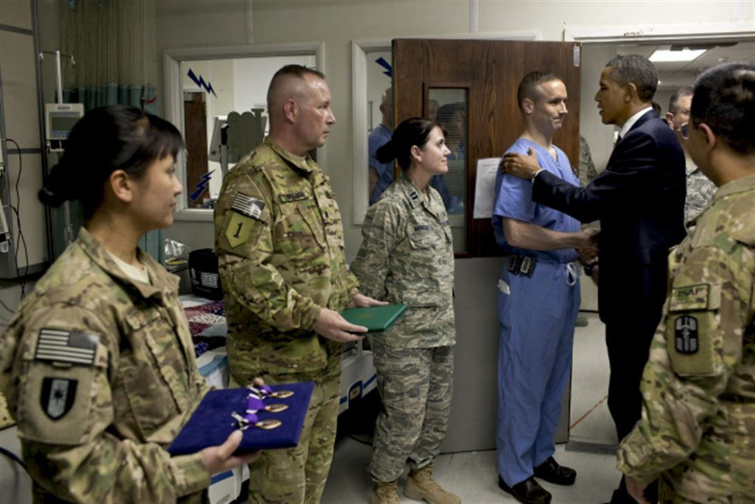
Using the HTML image-src-set and the HTML picture -tag. View this page in various viewport widths. The web browser will determine which image to load.
Resources
- Scott Vandehey: Responsive Images the Simple Way
- CSS Tricks: A Guide to the Responsive Images Syntax in HTML
- Kevin Powell: srcset and sizes attributes - [ images on the web | part one ]
- Kevin Powell: The HTML picture element explained [ Images on the web part 3 ]
- MDN Docs: The Picture element
- MDN Docs: HTMLImageElement.srcset
HTML demo's
HTML img-tag with srcset & sizes attributes for increased
performance
Smaller canvas- and file-size of the same image (not cropped). For better loading performance and saving bandwidth. The image below is loaded in various canvas sizes depending on the viewport width.

                <img

                      src="/img/obama-large.jpg">

                      width="1080" height="726"

                      alt="Barack Obama presenting Purple Hearts"

                      srcset="/img/obama.jpg?tr=w-1024 1024w, /img/obama.jpg?tr=w-768 768w, /img/obama.jpg?tr=w-480 480w"

                      sizes="(min-width: 480px) 100vw, 100vw">
HTML picture-tag with source-elements for (optional) art-direction in various
viewports
Different cropped versions of the same image. For better art-direction and performance. The crop of the image below changes in various viewports. Keeping the focus on the subject.

                <picture>

                      <source srcset="/img/obama.jpg?tr=w-400,h-240,cm-extract,xc-850,yc-170" media="(max-width: 800px)">

                      <source srcset="/img/obama.jpg?tr=w-700,h-400,cm-extract,xc-670,yc-250" media="(max-width: 1200px)">

                      <img src="/img/obama.jpg" width="1080" height="726" alt="Barack Obama presenting Purple Hearts">

                </picture>